Comparing results
Taking two (or more) results & quickly identifying how (& where) their flows differ, is one of the most valuable tasks in CFD & a key part of product development.
Making comparisons can be a very time-consuming process, but we’ve committed to building a suite of tools within AeroCloud, that will let you compare results & derive aero insights, with just a few clicks.
The first tools in the suite are shown below:
Force summary table
This table offers a convenient way to compare the key metrics from all of your project’s completed runs in one place (without having to click through to each simulation).
Click the “Completed Runs” tab in any of your projects to access the table (see below).
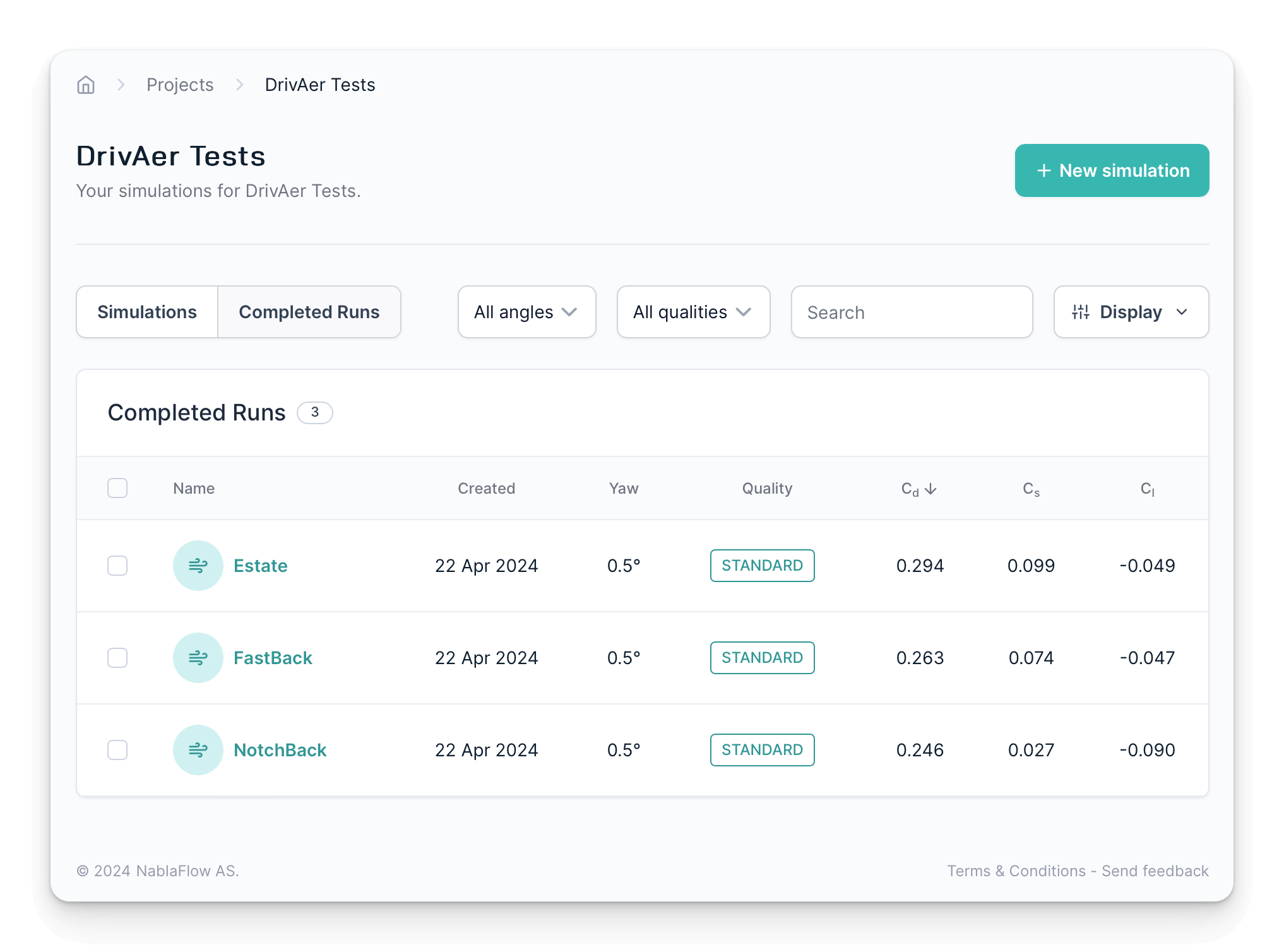
Here you can view, sort & filter your results by a number of metrics including forces, moments, date, quality & yaw angle. Just click on the controls at the top of the table to explore.
The configuration of this page is “sticky” & so your chosen metrics & filters will carry over to your next session.
Relative results
In addition, you can designate one of your runs as the project “baseline” (or reference) run & view your other results relative to it.
This quickly reveals the size & direction of the force differences between runs & helps you to spot your winners (& losers) more easily.
Select a single run from the table & click the “Set as baseline” button that appears at the bottom of your screen.
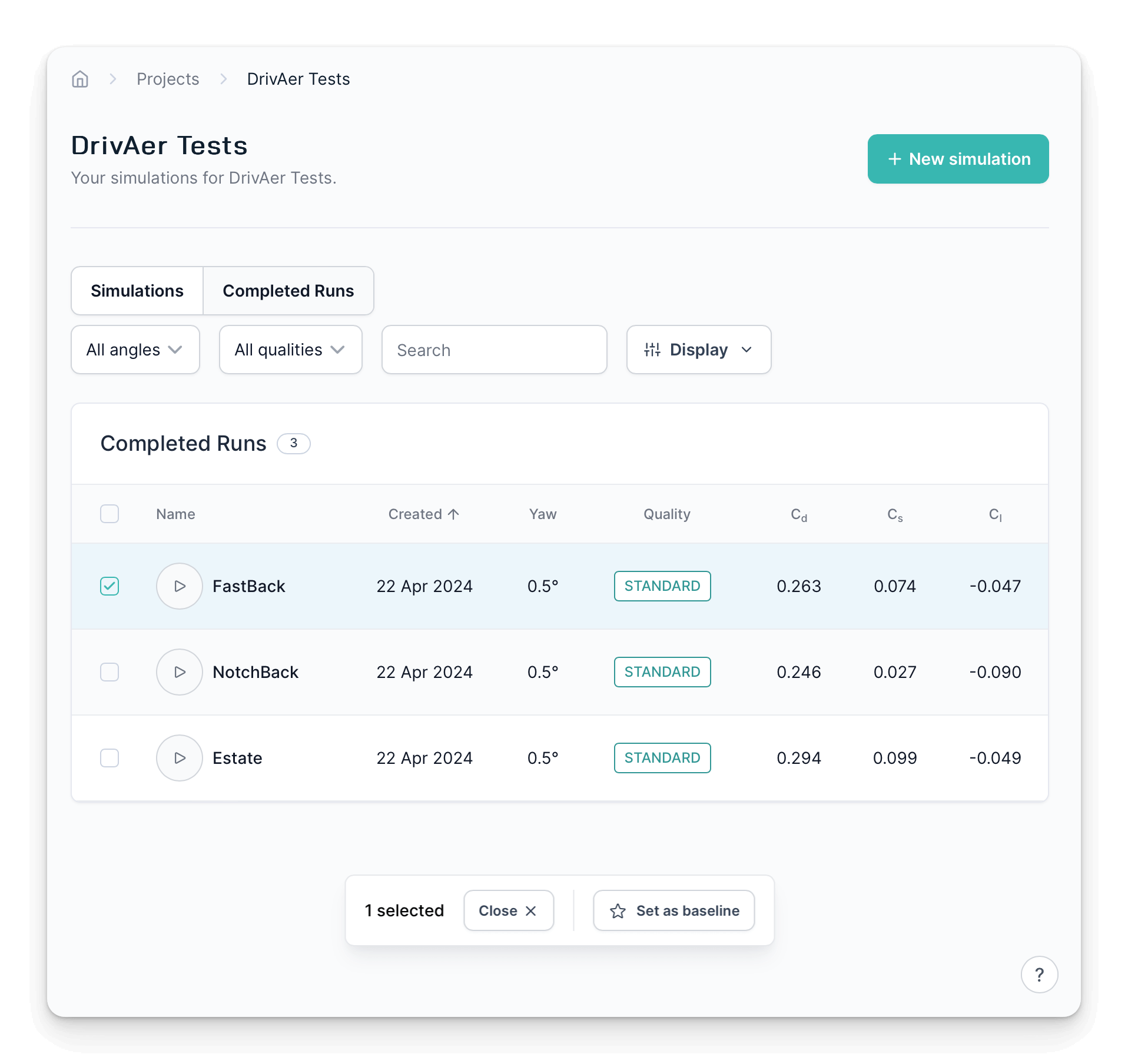
Once set, your baseline result receives a badge & is shown on a yellow background. The metrics for all of the other runs are now shown as relative to that baseline.
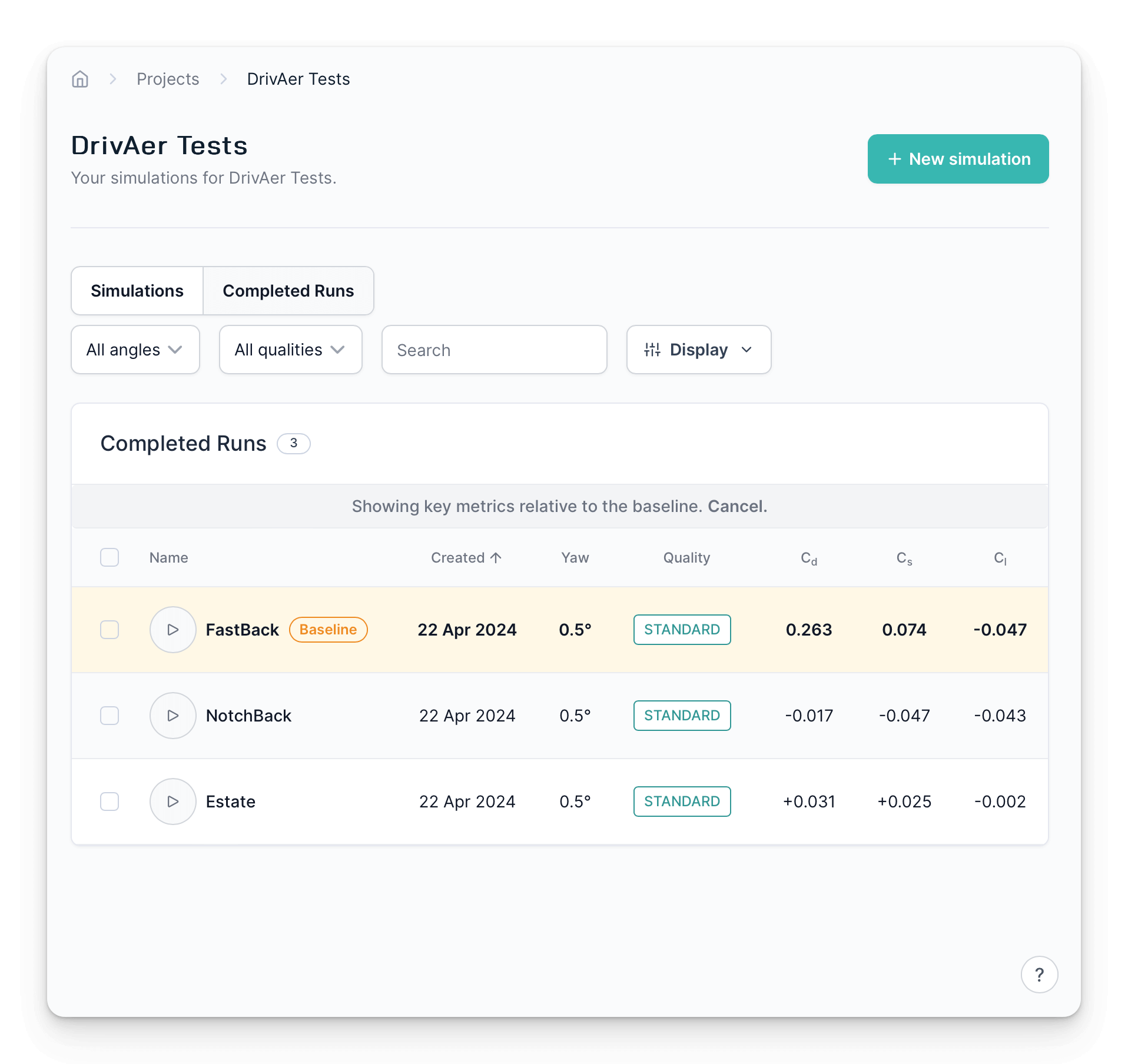
Your data can still be sorted & filtered whilst a baseline is set.
To designate a different run as your baseline, just select it & click the button, as before.
To unset your chosen baseline (& return to absolute values) simply click cancel in the banner shown just above the force table.
Force comparison plots
The second feature prepares force distribution plots for multiple runs.
Use the tick-boxes beside the run names to select up to 5 runs of interest.
A new dialog will appear at the bottom of the window prompting you to compare them.
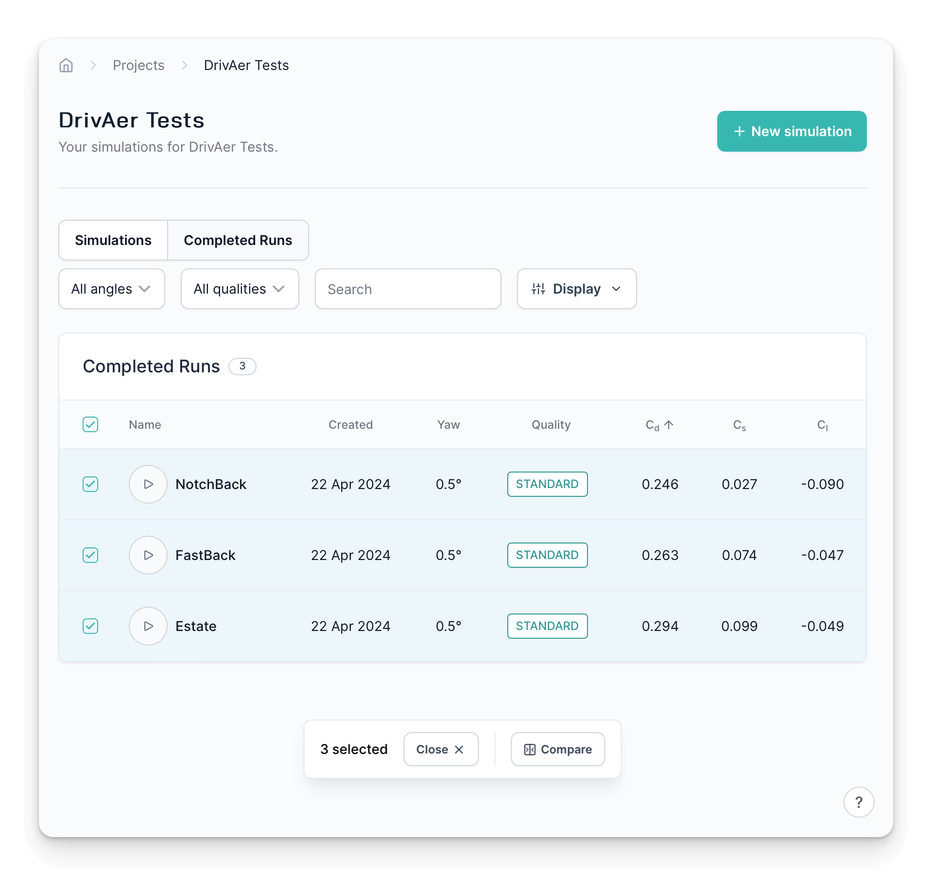
Clicking compare will overlay a new page containing force distribution graphs for your chosen runs.
By default it will plot cumulative drag, but all of the usual forces (sectional & cumulative) are available.
You can also toggle on/off the background image & select which model you want to show from your chosen runs.
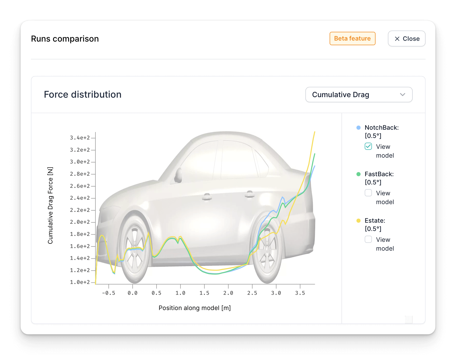
See here for more information on how this chart is built, what it represents & how to interpret it.
Slice Comparison View
The third comparison feature lets you easily compare the flowfield surrounding your models using the familiar slice plots.
To enable this feature, select two runs of interest from the completed runs table & click compare in the dialog that pops up.
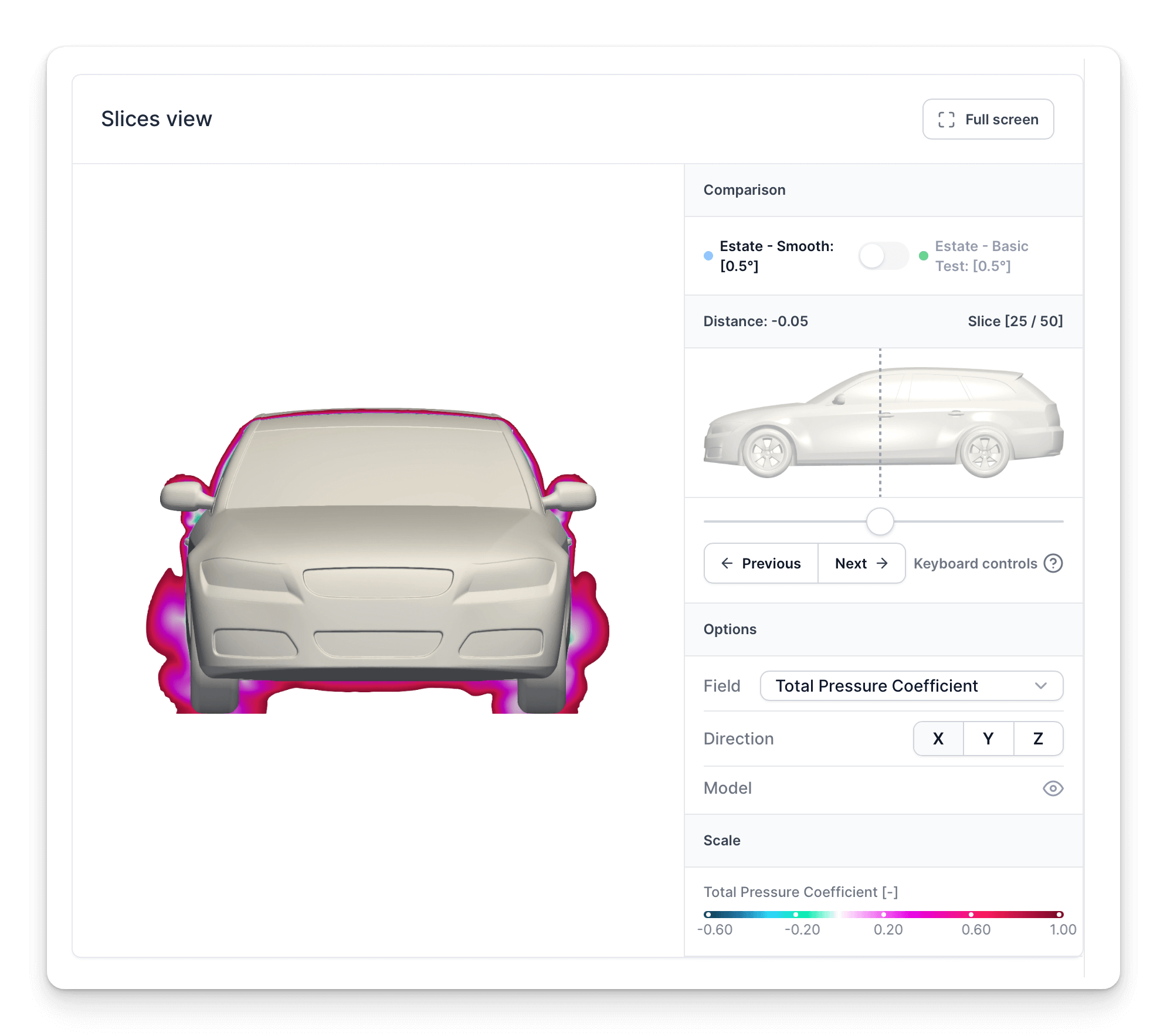
A new slices view will be shown on the comparison overlay, in the second tab named Slices.
The interface & options are the same as for exploring a single run (described here), except this viewer loads the slices from both runs at the same time.
A toggle is added to top of the control panel, showing which run is currently being displayed.
Move the slice to a position of interest & toggle between the cases to see how the flowfields differ.
The keyboard controls are particularly useful here, reposition the slice using left/right arrows & toggle between cases using the “C” key.
Surface comparison view
This comparison feature allows you to visualize the evolution and interaction of the flow around your model.
To use this feature, similar to the “slice comparison view,” you need to select two runs of interest from the completed runs table and click “compare” in the dialog that appears.
The surface comparison is visible under the third tab named Surface.
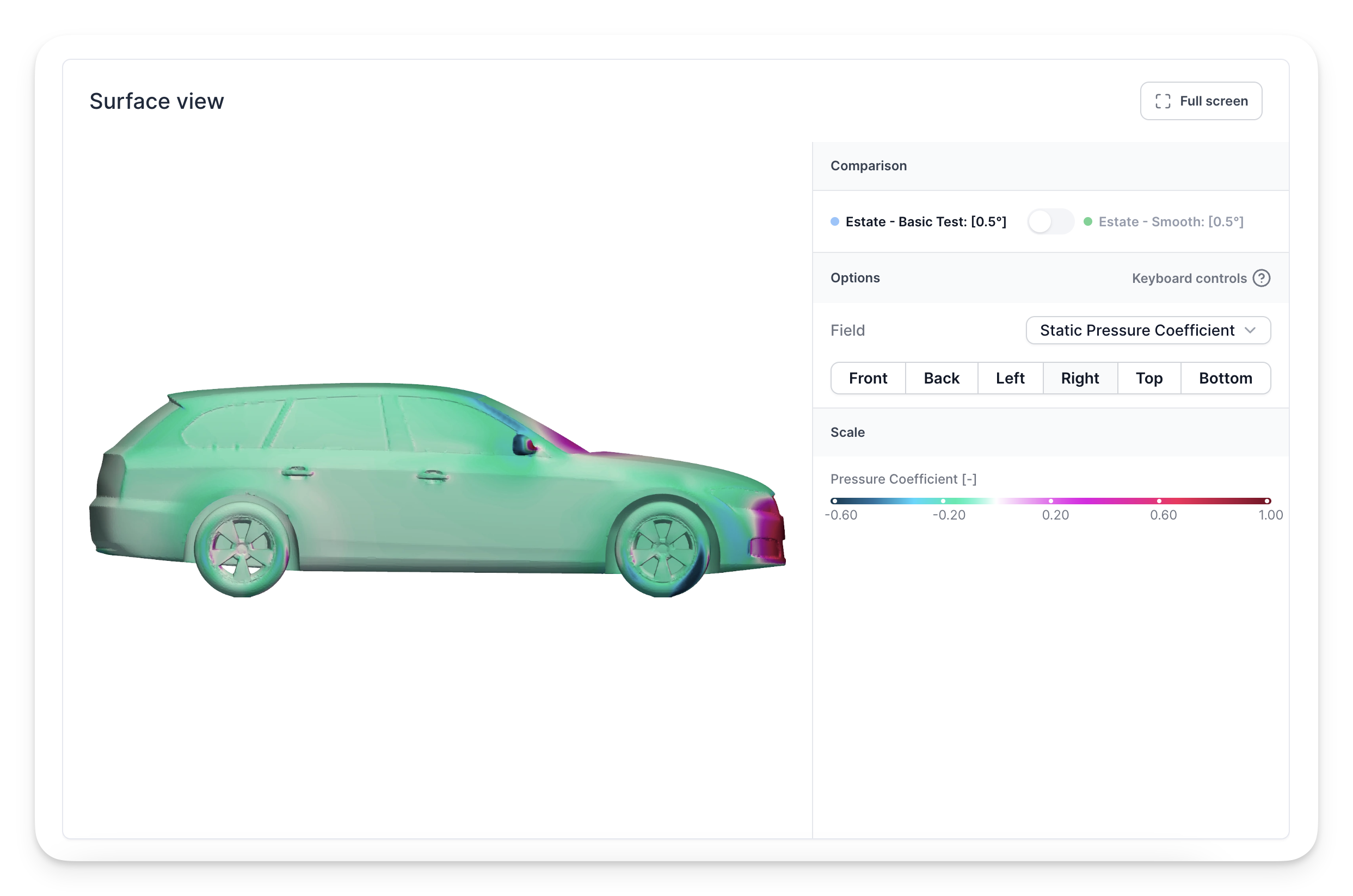
A toggle is present at the top of the control panel to switch between the two runs and indicate which one is currently displayed.
The parameters you can visualize include:
- Static Pressure Coefficient
- Surface Friction
- Drag Pressure
- Heat Transfer Coefficient
The strength of this feature lies in its ability to facilitate a quick switch between the two runs, allowing you to check noticeable differences by analyzing various views.
Keyboard controls are available: use the arrow keys to easily rotate the model, while the “C” key toggles between the two cases.